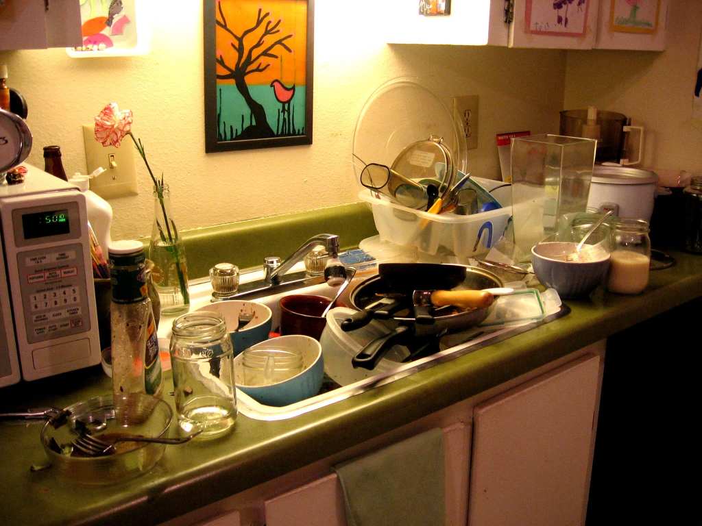
I’m gonna warn you: these photos are not pretty. In fact, some of them are downright offensive, in my humble opinion.
But you need to make up your own mind about these kitchen disasters.
Be prepared for what you’re getting into and hold on tight, my friends.
1. Interesting placement, that’s for sure.
2. Just cram it all in there.
3. Wow, that is kind of intense.
4. AT-AT attack is imminent.
5. This might be a little over the top.
6. Shower while you’re making dinner.
7. I see what you’re going for, but it just looks weird.
8. Proper placement, am I right?
9. I would actually live here.
10. Killin’ it,big time.
11. Still probably considered cheap for SF.
12. “Put the piano above the stove. Trust me on this one.”
13. Doesn’t look right for some reason…
14. Chandeliers for days.
15. Amazing that someone actually went with that.
Those are pretty whack, if I must say so myself.
Do you have any epic design fails in your home? Share them with us in the comments!
